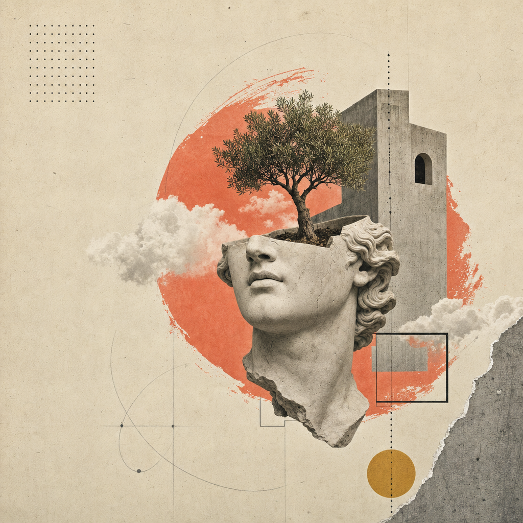
name: open-design-landing
description: >
Produce a world-class single-page editorial landing site in the
Atelier Zero visual language (Monocle / Apartamento / Études editorial
collage) — the same aesthetic Open Design uses for its own marketing
surface. The agent fills a typed inputs.json from a brand brief,
optionally generates 16 collage assets via gpt-image-2, then runs a
pure-function composer that emits a self-contained HTML file; a
separate path can mirror the Astro marketing site in apps/landing-page/.
Drop-in scroll-reveal motion and a
Headroom-style sticky nav are wired automatically.
triggers:
- landing page
- 落地页
- editorial site
- magazine layout
- hero collage
- atelier zero
- open design landing
od:
category: brand-page
surface: web
scenario: marketing
featured: 1
audience: founders, design studios, OSS maintainers
tone: editorial, restrained, premium
scale: viewport-anchored long-form single page
craft:
requires:
- pixel-discipline
- typographic-rhythm inputs:
- id: brand label: Brand identity description: Name, mark, tagline, location, languages, license, repo url. schema_path: ./schema.ts#BrandBlock
- id: nav label: Navigation links description: Up to 5 nav entries, each with optional count badge. schema_path: ./schema.ts#NavLink
- id: hero label: Hero copy + 3 stat rings + 4-step index schema_path: ./schema.ts#HeroBlock
- id: about label: Manifesto / about block schema_path: ./schema.ts#AboutBlock
- id: capabilities label: 4 capability cards schema_path: ./schema.ts#CapabilitiesBlock
- id: labs label: 5 lab cards + filter pills schema_path: ./schema.ts#LabsBlock
- id: method label: 4 method steps with thumbnails schema_path: ./schema.ts#MethodBlock
- id: work label: 2 selected-work cards on dark slab schema_path: ./schema.ts#WorkBlock
- id: testimonial label: Pull quote + author + 5 partner glyphs schema_path: ./schema.ts#TestimonialBlock
- id: cta label: Closing CTA + ribbon schema_path: ./schema.ts#CTABlock
- id: footer label: Brand description + 4 link columns + mega kicker schema_path: ./schema.ts#FooterBlock
- id: imagery
label: Image strategy (generate / placeholder / bring-your-own)
schema_path: ./schema.ts#ImageryConfig
parameters:
output_format:
type: enum
values: [standalone-html, nextjs-app, both]
default: standalone-html
description: >
standalone-htmlwrites one self-contained .html (CSS inlined, scripts inline, images relative).nextjs-appis the historical enum label for cloning the Astro-basedapps/landing-page/tree and wiring the same content.bothwrites both products into the output dir. image_strategy: type: enum values: [generate, placeholder, bring-your-own] default: placeholder description: >generatecalls gpt-image-2 (fal.ai or Azure) for all 16 slots.placeholderwrites paper-textured SVG frames so the layout is fully visible without an image budget.bring-your-ownassumes the user has dropped 16 PNGs atimagery.assets_pathalready. image_provider: type: enum values: [fal, azure] default: fal description: Provider forimage_strategy: generate. fal.ai is faster. outputs: - path: /index.html when: output_format in [standalone-html, both] description: Self-contained HTML with Atelier Zero CSS inlined.
- path: /assets/*.png (or *.svg) description: 16 collage assets, generated or placeholder per strategy.
- path: /nextjs/ when: output_format in [nextjs-app, both] description: Astro static tree mirroring apps/landing-page (folder name is historical). capabilities_required:
- file-write
- http-fetch # only when image_strategy=generate
- node-runtime # tsx or compatible example_prompt: | Build me an editorial landing page for "Lumen Field", an indie studio shipping a soundscape app for focus. Coral accent, Berlin coordinates, mention the iOS Beta TestFlight, three stats: 12 soundscapes / 4 presets / 1 daily ritual. Use the placeholder image strategy.
open-design-landing
Build a single-page editorial landing site (or a slide deck — see the
sibling open-design-landing-deck skill)
in the Atelier Zero design system: warm-paper background, Inter
Tight + Playfair Display, italic serif emphasis spans, dotted hairline
rules, coral terminating dots, scroll-reveal motion, and 16 surreal
collage plates.
This is the canonical Open Design marketing-page recipe — the example output is the very page you see at open-design.
The skill is fully parameterized. The agent fills one typed
inputs.json from the user's brief; the composer turns that JSON +
the canonical styles.css into a deployable artifact.
inputs.json + styles.css                       16 image slots
        │                                            │
        └──────────► scripts/compose.ts ◄────────────┘
                            │
                            ▼
              <out>/index.html  (self-contained)
              <out>/assets/      (PNG or SVG)
What you get
A single HTML file with all of:
- Editorial topbar (volume / issue / language strip), Headroom-style sticky nav with live GitHub star count.
- 8 numbered Roman-numeral sections with paper-textured background: hero (with 3 stat rings + 4-step index), about, capabilities (4 cards), labs (5 cards + filter pills + progress bar), method (4 steps with thumbnails), selected work (dark slab + 2 tilted cards), testimonial (pull quote + 5 partner glyphs), CTA (ribbon + email pill).
- Footer with 4 link columns + huge italic-serif kicker word.
- Scroll-reveal motion on every section (IntersectionObserver, respects
prefers-reduced-motion). - Fully responsive at 1280 / 1080 / 880 / 560 breakpoints.
Workflow contract
Run these four steps in order. The agent should complete each step before moving on, and prefer asking the user a focused question over inventing copy.
1. Gather brand inputs
Use AskQuestion (or the equivalent in your UI) to collect the brand
brief in chunks; do not dump the entire schema.ts on the user.
Map their answers into inputs.json matching the typed shape.
The eight question groups, in order:
| Group | Schema fields | Min answers | Notes |
|---|---|---|---|
| 1 | brand.{name,mark,tagline,description,location} | 5 | Mark = single glyph (Ø, ▲, ★…) |
| 2 | brand.{license,version,year,primary_url,contact_email} | 4 | URL is required; license defaults Apache-2.0 |
| 3 | nav[] (up to 5) | 3 | Optional count badges |
| 4 | hero.{label,headline,lead,primary,secondary,stats} | All | Headline as MixedText (sans+em+dot) |
| 5 | about + capabilities.cards[4] | All | 4 cards × {num,tag,title,body} |
| 6 | labs.cards[5] + method.steps[4] | All | Both grids fixed-arity |
| 7 | work.cards[2] + testimonial | All | 5 partner glyphs as inline SVG path data |
| 8 | cta + footer.{columns[4],mega} | All | Mega kicker is a MixedText like the headlines |
Open inputs.example.json for a complete
worked example (Open Design itself).
2. Decide the image strategy
| Strategy | When to choose | Cost / latency |
|---|---|---|
placeholder | First pass. Demo. Slide internal. No image budget yet. | $0, <1s |
generate | Final delivery. Brand wants original collages. | ~$0.40, ~6 min |
bring-your-own | User has art direction PNGs. Drop them at assets_path. | $0, 0s |
Set inputs.imagery.strategy accordingly.
placeholder — frame mode
npx tsx scripts/placeholder.ts <out>/assets/
Writes 16 .svg files (with .png aliases for compatibility) into
<out>/assets/. Each placeholder shows the slot id, ratio, pixel
dimensions, and the prompt hint from image-manifest.json. The
composer's <img src='./assets/hero.png'> etc. just work.
generate — gpt-image-2 mode
FAL_KEY=... npx tsx scripts/imagegen.ts <inputs.json> --out=<out>/assets/
Calls fal.ai's openai/gpt-image-2 synchronous endpoint per slot.
Composes prompts as: style anchor (paper-collage editorial system)
- brand variables (name / nav / headline / italic emphasis pulled
from
inputs.json) + per-slot composition (e.g. cropped plaster head + tree growing through arch). Skips slots whose target file already exists; pass--forceto re-render.
Without FAL_KEY, the script prints the prompts so the operator can
route them through the /gpt-image-fal slash-command skill manually.
bring-your-own
Drop 16 PNGs matching assets/image-manifest.json filenames at
inputs.imagery.assets_path. Done.
3. Compose the artifact
npx tsx scripts/compose.ts <inputs.json> <out>/index.html
The composer reads inputs.json and ../styles.css, then writes one
self-contained HTML file. The page includes:
- The full Atelier Zero stylesheet, inlined.
- All section markup with
data-revealattributes for staggered scroll motion. - Inline IntersectionObserver script (mirrors
apps/landing-page/app/_components/reveal-root.tsx). - Inline Headroom nav script (mirrors
header.tsx). - Inline GitHub star-count fetcher (auto-detects from
brand.primary_url).
4. (Optional) Mirror the deployable Astro site
For deployable production output, fork the apps/landing-page/
package: copy it into your workspace, align app/page.tsx with content
from your inputs.json, and copy your <out>/assets/*.png into the
paths expected by app/image-assets.ts / R2 URLs. Build with
pnpm --filter @open-design/landing-page build for a static out/
export ready for any CDN.
A future iteration may bundle a composer that emits the full
apps/landing-page/tree frominputs.jsonin one command. Until then, fork-and-edit is the supported path.
Self-check before delivering
Before marking done, the agent must verify:
-
<out>/index.htmlopens in a browser without console errors. - All 16 image slots load (no 404s in DevTools network tab).
- Headline italic emphasis spans render in Playfair (not sans).
- Coral terminating dots appear at every
displayh1/h2 end. - Scroll from top to bottom; every section animates in once.
- Resize to 880px and 560px; no horizontal scroll, no overlap.
-
prefers-reduced-motion: reduce(DevTools → Rendering) disables transitions cleanly. - Lighthouse: contrast AA, font-display swap, no layout shift on the hero (CLS < 0.05).
Files in this skill
skills/open-design-landing/
├── SKILL.md                 # this contract
├── README.md                # quick-start
├── schema.ts                # typed inputs (single source of truth)
├── styles.css               # Atelier Zero stylesheet (single source of truth)
├── inputs.example.json      # Open Design as the worked example
├── example.html             # canonical rendering (regenerated from inputs.example.json)
├── scripts/
│   ├── compose.ts           # inputs.json + styles.css → index.html
│   ├── imagegen.ts          # gpt-image-2 wrapper (fal.ai)
│   └── placeholder.ts       # SVG paper-textured frames
└── assets/
    ├── *.png                # 16 collage plates (Open Design instance)
    ├── image-manifest.json  # slot → file/dimensions/prompt mapping
    └── imagegen-prompts.md  # human-readable prompt pack
Boundaries
- Do not invent new colors or typefaces. Tokens live in
design-systems/atelier-zero/DESIGN.md; extend the design system before adding a new ramp here. - Do not drop
data-revealattributes from generated markup. Without them the page goes static and feels dead. - Do not wrap the composed HTML in a framework that injects its own stylesheet ordering — Atelier Zero relies on stylesheet-order cascade for paper texture and z-index of side rails.
- Do not add a separate stylesheet file for the Astro landing-page
fork; copy
styles.cssverbatim intoapp/globals.cssso visual parity stays one-to-one.
See also
design-systems/atelier-zero/DESIGN.md— token spec.apps/landing-page/— deployable Astro static counterpart.skills/open-design-landing-deck/— sibling slides skill that reuses this design system.